|
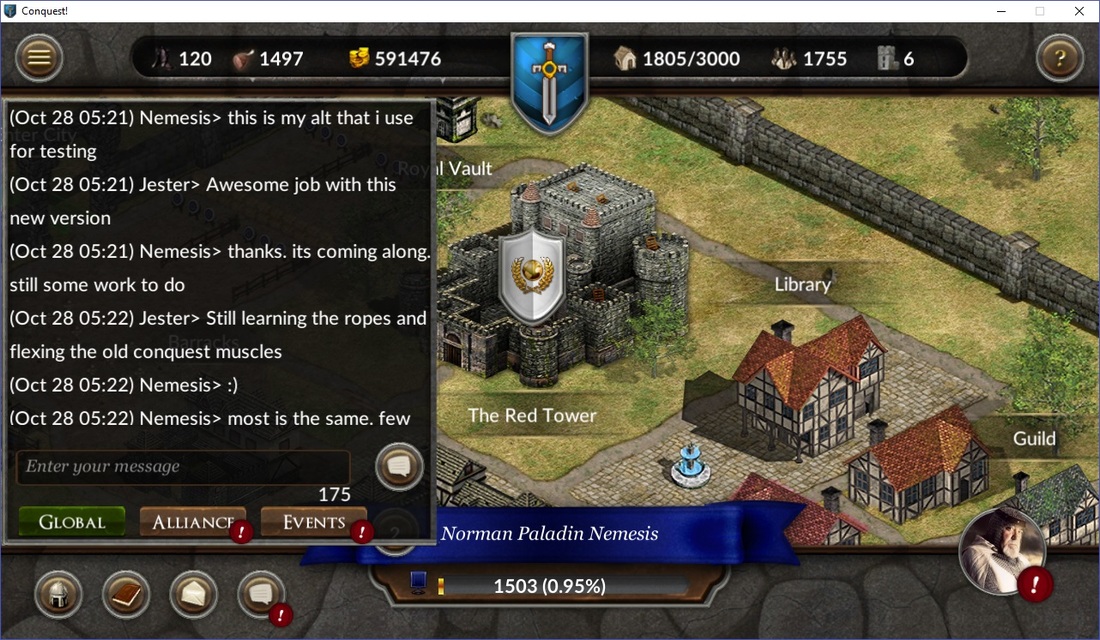
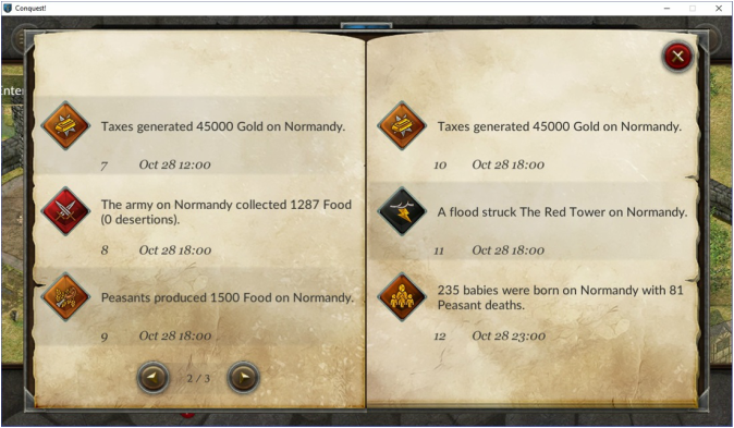
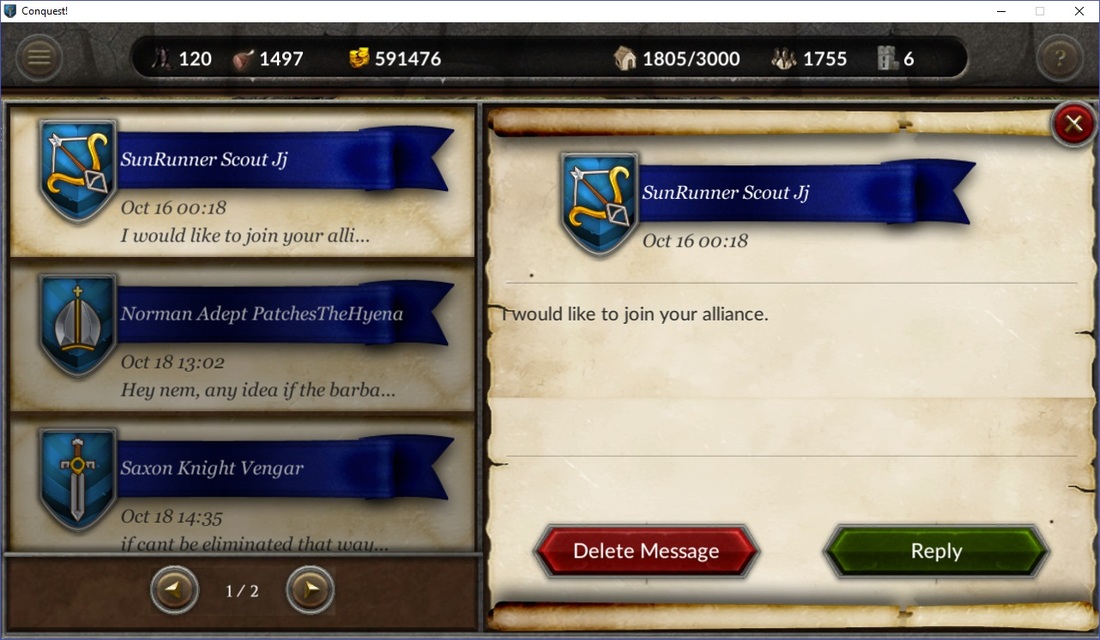
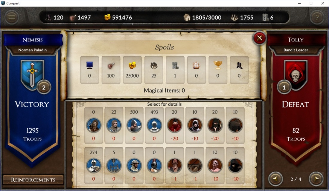
This month was spent building on the improvements made for the 2.0 interface for Conquest!. Major changes were made to chat, the journal/log, private messages, and combat reports. Since version 1.x Conquest! has used a pop-up window style to interact with players. In many cases, tabs were provided to allow players to switch between pop-ups to see additional information. For example, private messages were displayed on one tab and sending a new one (or replying to an existing one) was on another. This meant lots of scrolling and new players would often miss the tabs (and critical information). With the changes made this month the designer and I created new windows to eliminate the tabs and help cut down on the scrolling. The effect is a much cleaner user experience. Let's start with the new chat interface: The tabs have been replaced with buttons with labels and the scrolling window has been replaced with a sleek semi-transparent background. I also doubled the chat and event history from 25 to 50 entries. Here is the new log: Rather than scroll up and down to see entries, players can now simply select the left/right arrows to quickly page through. We also added icons for each, allowing players to identify the entries or events visually. The player's journal works in the same fashion. For private messages, players scroll through the messages on the left and, once selected, reply or delete it on the right: With the old pop-up design, players had to scroll to see all the messages (and move between pages) and select a different tab to reply to the message. There was no preview function either. Perhaps the one I'm most excited about are the changes to combat reports. The old pop-up design was not large enough to show all the spoils, forcing players to scroll to find them. To view enemy troops and casualties, the 2nd and 3rd tabs had to be selected (with additional scrolling to see everything). Now, the most important parts of the report are visible at once: Only enemy reinforcements are not shown on the main window, and those can quickly be accessed by the button on the bottom left. Attacking the wildlands was on a separate scene in Unity, which meant jumping to the kingdom screen to view the report (this happened automatically). Now the report displays on the quest scene itself which allows players to keep fighting without switching scenes.
Behind the scenes, I was also able to remove duplicate code by moving these new windows into their own class (versus being part of the Unity scene). This streamlined the development process for me and allowed me to add combat reports to the Quest scene (as previously mentioned) quickly and easily. During this process, I have also corrected some inefficient code, as I learn more about Unity as a platform. We are going to tackle spy, city markets, and questing next. Check back for updates to see our progress. Sign up for the Conquest! mailing list here and follow the journey on Facebook or Twitter. Until next time, I hope to see you in the game.
1 Comment
Conquest! UI version 2.0 officially went live on September 23! The new UI brought a host of changes, enhancements, and bug fixes. So far, the reception has been overwhelmingly positive. And thanks to very through beta testing there were no major bugs reported.
This week design work started on a new interface for private messages. The current design uses our "standard" pop-up with two tabs. The new one will be one larger popup, with a list of messages on the left and composition/viewing on the right. Other areas targeted for improvements are the vault/magic shop and possibly chat. I expect development to slow down a bit, since the UI is now in a good place, and a shift to marketing to occur. Our Twitter and Tumblr activity has helped bring new players in but Conquest! still has issues explaining what to do and how to do it. I would expect enhancements to the tutorial over the coming weeks to address these issues. Enhancements made since launch include standardizing the main menu and bottom bar between the kingdom and city screens and minor updates to the help and basics. A final note this week about the build size. I was very pleased with the build size reductions we were able to make. The iOS build was reduced by ~20MB, while the Android build ~3MB (it was already fairly small). This was accomplished by reducing the number of Unity screens (from 18 to 9) and using blank buttons and panel headings with text instead of custom graphics for each one. This also means I can create buttons or pop-ups as necessary without needing new graphics each time. Conquest! does not use any on demand resources (everything is packed inside the build), which makes development simpler for me. By reducing the download size, it ensures Conquest! can be picked up over cellular networks (Apple has a 100MB limit for this). The overall install size of the application was also reduced, which saves space on devices where this might be a concern. In summary, a win/win for everyone. Sign up for the Conquest! mailing list here and follow the journey on Facebook or Twitter. Until next time, I hope to see you in the game. |
AuthorJames has been working on Conquest! since 1993. Archives
June 2024
Categories |
Copyright 1993-2024 GreenLion Gaming All Rights Reserved


 RSS Feed