|
Since Conquest! was converted to the C language circa 1998, it has used an XML format to exchange information. This worked fine for years but I recently became concerned with the payload sizes, as the amount of data the server needed to send the client has increased. Additionally, I was not using any advanced XML capabilities (e.g., meta data support) that would warrant its continued use. I started looking at JSON and became convinced after seeing payload sizes reduced by 10-30%. For example, here are examples of common commands and sizes (in bytes).
None of the player or world data is stored client-side, so each action a player takes requires updates from the server. Over time, these will add up to huge savings and should improve the end user experience. Additionally, I wanted to ensure backwards compatibility with existing XML based clients, so the server had to support both formats until I force a client update. I'm using the client version number to determine which to try first.
Part of the challenge was finding existing libraries for both C (server) and Unity3D (client) to handle JSON parsing.
For the server, I decided on json-c. The library itself is great but I found the documentation on the GitHub repository lacking. It wasn't until I found this tutorial that it all finally clicked. This tutorial covers everything from installation to memory management. Another good reference was the header file documentation.
Now that the server was covered, I turned to the client. I installed the Newtonsoft Json package (available for free) and followed the guide here. Serializing and Deserializing the response back from the server took some time to get working. I ended up having to break down the JSON object by object and add them back in one at a time to locate my errors. I found this site very helpful when creating my initial classes.
As part of this conversion, I also moved from using Unity's PlayerPrefs to a JSON configuration file. Over time, the amount of data I was storing in PlayerPrefs had gotten large and I needed to represent more complex structures. I was able to use Newtonsoft for both the responses from the server and management of the configuration file. I even wrote a conversion function to silently upgrade client from PlayerPrefs to the new settings file.
It was a lot of work over several days, but I'm pleased with the results.
UPDATE: After some consideration, I ended up witching from Newtonsoft to the standard JSON utility included in Unity. I didn't need the advanced capabilities of Newtonsoft and the default utility works fine. One item which did cause me problems is that all classes and subclasses need to be identified with [System.Serializable] for the default utility to work properly.
0 Comments
Here is the summary of enhancements made to Conquest! in 2023.
One important item left off is finally utilizing Application.persistentDataPath to store the ~3,000 messages utilized throughout the game. In the past, if I wanted to update messages I would have to re-deploy the entire client. Now the client is pulling the messages down when the server tells it to. This has been a tremendous benefit to me and the players as I can quickly fix spelling or grammatical errors (or even add new error messages). There are Unity packages which allow for dynamic translations but when I implemented the UI circa 2016, I didn't know about them. And when I did learn of them, I was concerned about performance. In hindsight, I may have taken a closer look at those packages vs doing all the translations myself. Major Enhancements
Alliances
Classes
Events
UI
Minor Enhancements Artifacts
Heroes
Misc.
When Conquest! was first developed in 1993, it used a very simple model to exchange data between the server and players. A player would send a command and the server would reply with an appropriate response. If a player needed additional information, they would issue another command to retrieve it. This worked well for a text-based UI.
When the UI was developed in 2016, essentially the same model was used. However, it quickly became apparent that additional information was needed to update the UI. Therefore, after a player issued a command and the server sent the initial response, the client would send additional commands to the server to retrieve the rest of the information. For example, consider this sequence:
In January of 2021, I switch from a pull to a push model. With this model the server would decide what information to send after processing a command. The above example now looks like this:
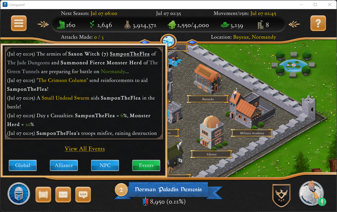
I have updated the pull model to use a centralized function to examine the player structures after a command is executed to dynamically determine the data required to send to the client. In this way, I do not have to worry about a command missing something (or sending too much data). The correct data is sent automatically each time. After a recent deployment, a player named TaxE contacted me with an unusual bug: none of the cities were showing on the travel maps! This renders Conquest! virtually unplayable. During the course of troubleshooting with TaxE, we discovered that this problem affected not just his Android device but his laptop too. Switching from Wifi to Cellular did not have any effect. I was stumped until I began brainstorming with long time player, Elric.
Until recently, Conquest! used integers to represent cities on a map in a 10x10 grid. These coordinates are sent from the server to clients as strings, where they are transformed to numbers and used to render the cities. During a refresh of the maps, I realized I needed greater precision for positioning so I switched from integers to floating points. Naturally, I changed my code: int.TryParse(Input, out Number) became float.TryParse(Input, out Number) When talking with Elric, he asked where TaxE was located. Turns out, TaxE was outside the US where a comma is typically used as a decimal separator vs a period in the US. Using the original float.TryParse(), clients outside the US were transforming city coordinates such as 3.7 to 37, rendering the cities far out of bounds of my 10x10 grid! A quick Google search revealed the solution: float.TryParse(Input, System.Globalization.NumberStyles.Float, System.Globalization.CultureInfo.InvariantCulture, out Number); By forcing TryParse() to utilize InvariantCulture, which by default uses a period as a decimal separator, the numbers are now being transformed correctly. A huge thanks to both Elric and TaxE for helping work through this one!
A reoccurring suggestion has been to have names in chat/world events selectable, so players could quickly select others without resorting to cut/paste on Windows or trying to remember on other platforms. This seemingly innocuous suggestion lead to a project which took 5 days to complete!
When the Unity version of Conquest! started in 2015, it used all standard Text, Input, and Dropdown fields. These standard fields ship with Unity and are easy to use. Unfortunately, they do not support some simple and some advanced use cases e.g. underlining or embedding links in text. The latter functionality is what I really needed to make clickable player names work. Google and I turned up some workarounds to get links working in standard Text objects (maybe?) but it quickly became apparent what I really needed to do was convert to using TextMeshPro. I decided early on that I as going all-in on TextMeshPro and this required converting all buttons, dropdowns, input, and text fields to use the new objects. Fortunately, I recently converted many panels and popup windows to prefabs, which meant I only had to modify them once for them to be fixed everywhere. The first thing to do was add TextMeshPro to my project, an easy task accomplished via Windows > Package Manager. Adding <link> tags to text is also easy but responding to those links was more challenging. I found these two sites to be the most helpful in getting everything configured: www.youtube.com/watch?v=lyZuCnARNSw&ab_channel=JasonWeimann www.feelouttheform.net/unity3d-links-textmeshpro/ Here are the namespace and object names as a reference:
Assigning the new script to my text objects was simple but I had two major problems. First, I had inadvertently unchecked "Raycast Target" on the text object, which naturally prevented the IPointerClickHandler event from being triggered. The second was invoking the function I wanted from a different class (it wasn't opening a standard URL, which I could have accomplished with Application.OpenURL()). What I had to do was create an instance of the object which contained the function: public class MyClass : MonoBehavior { public static MyClass Instance; void Awake() { Instance = this; } public void MyFunction() { DoStuff(); } }
And then invoke the function using this notation: MyClass.Instance.MyFunction(). There are probably better ways to organize a project to allow this, but this is what worked for me. Now, player names are finally clickable! And underlining text is pretty neat too. =)
On October 12th, Conquest! launched on the Steam platform. Like other hosting sites, Steam has its share of idiosyncrasies but once those were worked out I was able to launch successfully. The guide that helped me the most was here: The Simple Guide to Steamworks API in Unity: Uploading Builds | by George Dutton | Finite Guild | Medium
Note that when the Steam platform first created the project for Conquest! it failed to create the default packages. After spending a day attempting to debug this myself (thinking it was a problem with the build or configuration) I opened a support ticket and learned this sometimes happen. Support created the default packages and everything starting working. Adding Conquest! on Steam has seen the biggest increase in the player base ever (including when it was originally on IRC). Conquest! is still difficult to learn and the UI has some usability "quirks" so the overall retention rate is small but I would strongly recommend getting any game listed there. I also went back and updated my submissions to Itch.io and Game Jolt. I'm not sure how much of an impact these platforms have but every little bit helps. I tried to submit to Gog.com but in their automated email back to me, they indicated an automatic pass on free games. So I'll keep looking for other platforms to list Conquest! on. Since its inception in 1993, Conquest! has only been available in the English language. Based on some reviews of Conquest!, adding additional languages seemed like a good idea. Fortunately, a design decision made circa 1995 made the process much easier.
Before the change, all game messages were hard coded within the server. This meant that every time a new message was added or an existing one was changed, the game had to be redeployed and the server restarted. At that time I decided that I would assign all messages with a numeric code and send that to the clients, which would interpret how to display the message (e.g. instead of sending "You must be a Paladin to use this skill." the server sends "35Paladin"). Originally, this was meant to cut down on the network traffic and facilitate creating graphical clients (which didn't materialize until 2016!). However, it had the nice side effect of allowing translations to other languages. This week I completed translations of Conquest! to French, German, and Spanish. It took about a week to translate the ~2000 different messages using Google Translate. When the graphical client was created in 2016, once again all of the help, prompts, and field labels were hard-coded in English. In addition to the messages from the server, all of these had to be pulled out and translated. I did look for a way to perform dynamic translations but I didn't locate a way to do this and I was wary about build an external dependency, especially given the dynamic nature of the game. Now that the plumbing is in place, creating files for additional languages requires just the translation effort (which is still a huge amount of work!). Some items (e.g. level titles, troop names, etc.) cannot be translated at this time. I'm eyeing a translation to Italian in the future but for now I'm going to take a small break (its actually mentally taxing to work on translations). Yesterday I released version 3.18.05 of the game client which concludes 3.0 development (minus bug fixes of course!). What started as an effort to update the 350 images in the game turned into a major overhaul with 900 new ones! When version 2.0 was released, it reused many of the same images from version 1.0 (e.g. alliance crests, maps, troops, etc.). For version 3.0 all but one image was replaced. By using the same artist for all the graphics, they have the same consistency and style. A big thank-you to Vi from 99Designs.com for his efforts in making 3.0 look amazing We also increased and standardized the dimensions of the images. For example, in version 2.0 the icons depicting army attributes were 30x30; in 3.0 they are 128x128. Obviously, this makes a huge difference in the quality. Other images were odd dimensions (e.g. 94x120 for the shields) and a mixture of drawings and photos made to look like drawings. Additionally, I contracted with an audio engineer from UpWork.com and replaced the sound effects. The ones I had were mashed together from various free audio sites for version 1.0 of the game. Now all the sounds have been designed by one person and are a consistent style and quality. Thank you Leah! The improvements in 3.0 encompass the client and server and there are so many it's hard to catalog them all. But here are the highlights: Client
To see the evolution, consider these 3 screens, all depicting the entry point for playing Conquest!. Version 1:  Version 2.0:  Version 3.0:  It is bitter-sweet that this project is ending. I have immensely enjoyed working on Conquest! again and I'm going to miss those weekly dumps of new graphics. But now that this chapter closes the next one begins: aggressively marketing Conquest!. My plan right now is to hire a digital marketing firm to do a short 1-2 week blitz. I expect this to start in late summer/early fall. Stay tuned.
Conquest! Version 3.0 Summary
Version 3.0 represents the first major work done on the Conquest! application in over three years. Here is a breakdown of the major changes: New Graphics I have contracted with a new artist to update over 130 of the game’s icons. To put this in perspective, Conquest! has over 350 total icons in the game (that total does not include maps, buildings, etc.). The updates included in this version are troops, artifacts, classes, heroes, ships, and the launch icon. Over the next several months I will be working to upgrade the remaining graphics. My priority is removing poor quality or mismatched ones first. I have also removed some single-use icons and replaced them with a functionally similar one used elsewhere in the game (e.g. removing the “infected” icon in kingdom overview and using the “bad event” one from log events). This not only reduces the overall number of icons I must replace but also the size of the application. Improved Combat Reports Combat reports have several enhancements.
Spy reports have benefited from some of the changes from combat reports (e.g. reduced scrolling, streamlined reports). Alliance crests are now visible in spy reports and lists throughout the game (e.g. rank, kings, titans). Improved Functionality Several screens were improved.
Rather than use fixed sizes, several pages were refactored to use percentages instead. This permits the Unity engine to scale the page as needed to fit the resolution of the device. And each page in Conquest! was tested for functionality simulating a variety of phone and tablet devices. This should allow Conquest! to render properly across a wider variety of devices. Updated Social Links Facebook and Tumblr were replaced with Discord and a link to the main web site. How time flies when you are developing! Between the holidays and all the work being done on Conquest!, I had forgotten how long it has been since my last post. Let's get right to all the new stuff! The first item is the guild now keeps the last 5 spy reports. I severely underestimated how useful this is until I started playing! Before the change, spy reports were limited to just the last one and they were lost when you logged out. Now they are stored on the server and can be retrieved by clicking "Reports" from the guild. Like combat reports, I added a timestamp to you know how stale the information is. In the future I might expand the history a bit more. Next, I continued work to remove popups and reduce scrolling by tackling combat orders and statistics. Previously, these were two separate popups with the former showing your army's food and gold upkeep, as well as options to set surrender and auto-enlist, and the latter showing all of the numbers the game tracks about your player (battles won/lost, troops killed/lost, etc.). I decided to combine these into one and remove the food and gold upkeep (it is available under the kingdom overview): 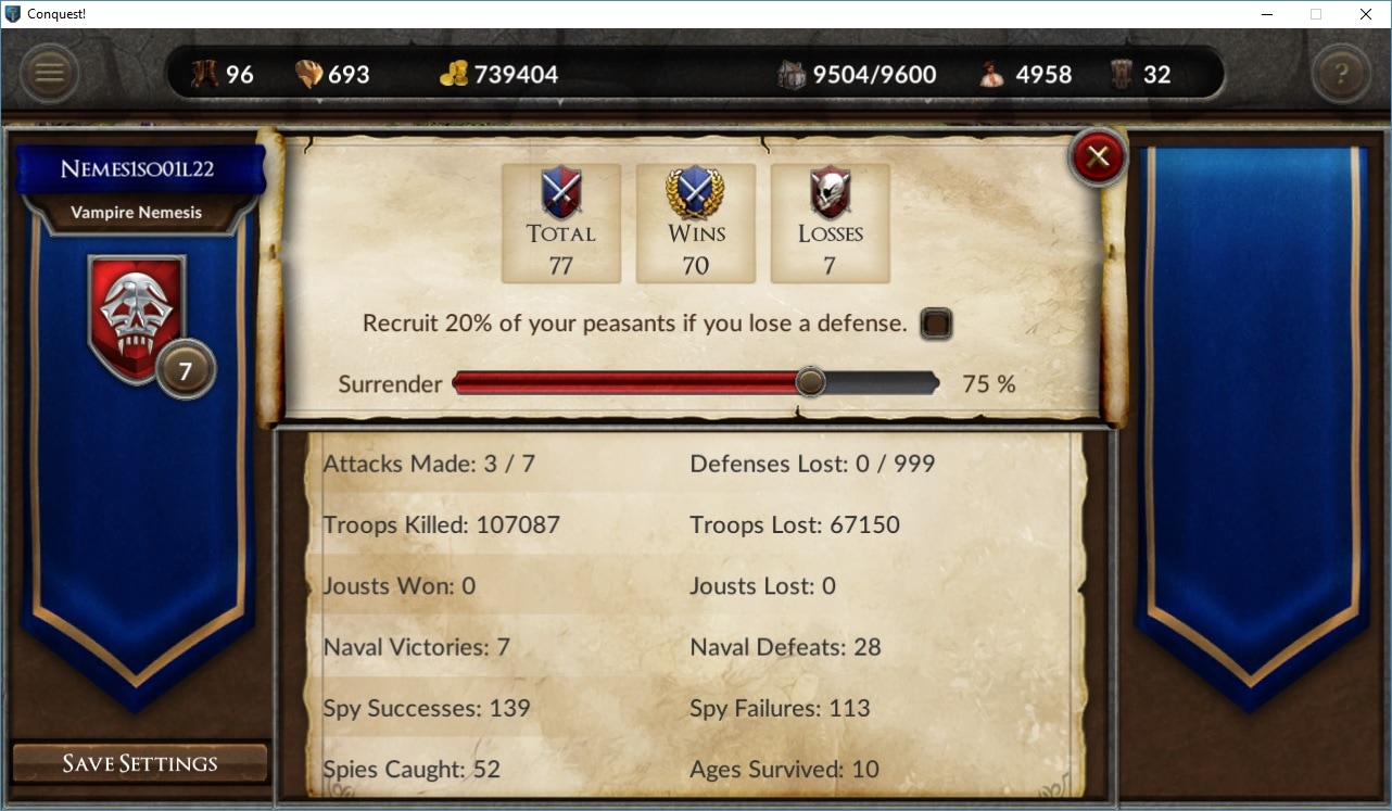 One screen, no scrolling. The next useful feature was (finally) adding tooltips! I was watching MEIT Dev's feedback for Conquest! and noticed he tried selecting items to get more information. There is no mouse over for mobile clients but now clicking on items in the HUD or your character class, pops up a small 1-2 sentence description. For example, I clicking on the "house" in the HUD: 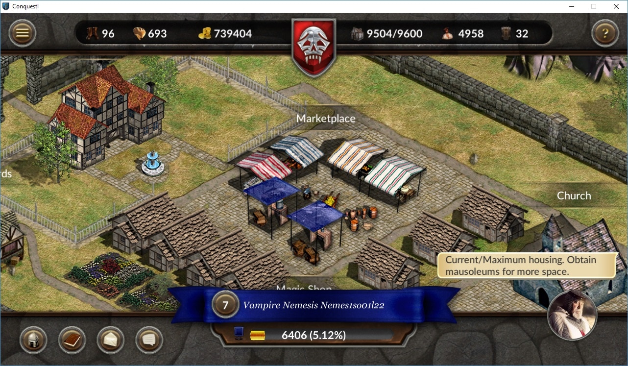 The tips work on every screen and add some much-needed aid to new players. On the backend, I also got around to improving the network performance of the client. When the UI was first launched, I put in a kludgy solution to read data coming in from the server. It was fine for launch, but now I'm using a proper event driven read. This also removed the worker thread from the client, which also had the side benefit of making Conquest! web based via HTML5. Or so I thought; HTML5 doesn't support direct socket connections. Doh! The next improvement came from adding friendly reinforcements to the combat reports. This has been asked for on several occasions but a certain stubborn developer resisted (for some reason). I finally added these: 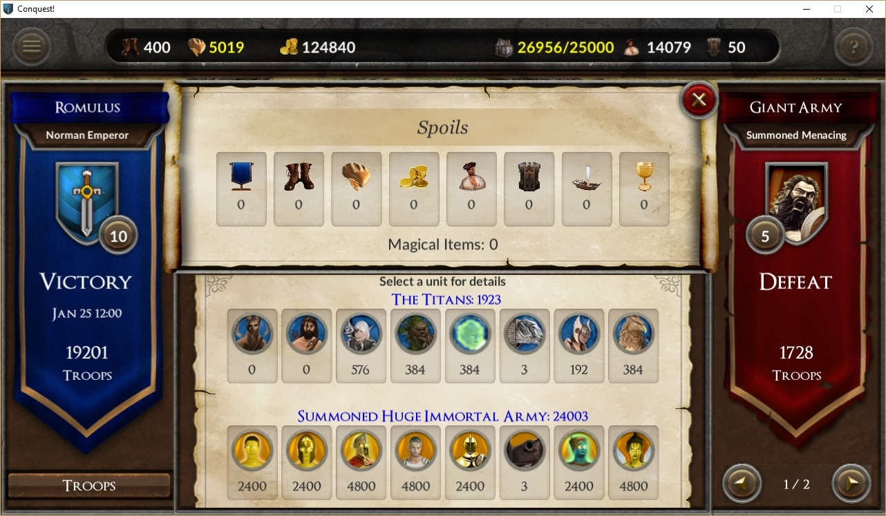 Friendly reinforcements are shown in blue, while enemy reinforcements are shown in red. The biggest usability issue addressed was auto-scrolling to the bottom of the chat and event windows. It took me a while, but I discovered that modifying a ScrollRect's verticalNormalizedPosition property was much better than trying to accomplish the same thing by modifying the RectTransform of the same object. I also discovered the ForceUpdateCanvases method under the Canvas object. For chat, I call this prior to adjusting the normalized position. Using this same method, I corrected a bug where the travel map would scroll too far and be out of bounds for some resolutions. The other nice feature was adding an option to reverse sort your journal. A small change, but a large improvement in usability. Finally, the weather screen got its makeover. Like the other popups I removed, it became a full screen window. I also added a quote regarding the season and an overview of the effects (none, light, moderate, severe). 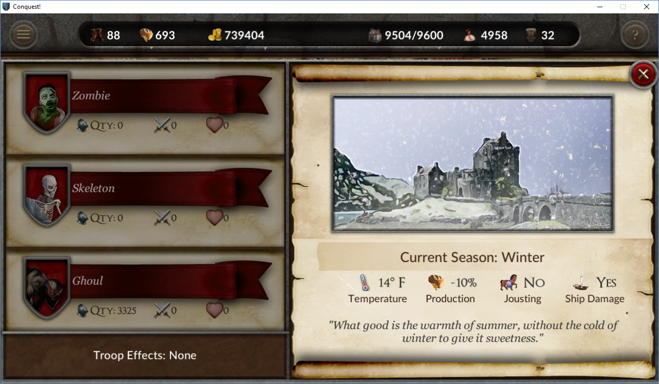 Like what you see? Have a suggestion to make it better? Email me here: [email protected]
Sign up for the Conquest! mailing list here and follow the journey on Facebook or Twitter. Until next time, I hope to see you in the game. |
AuthorJames has been working on Conquest! since 1993. Archives
June 2024
Categories |
 RSS Feed