|
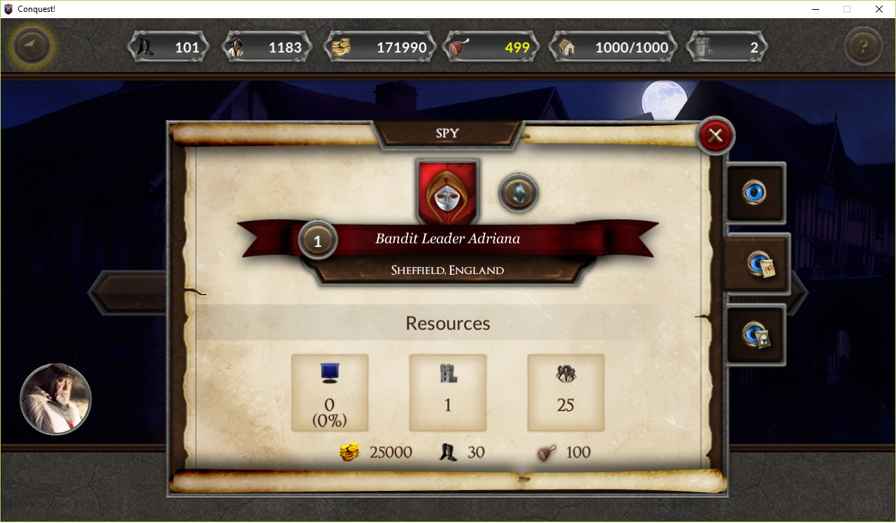
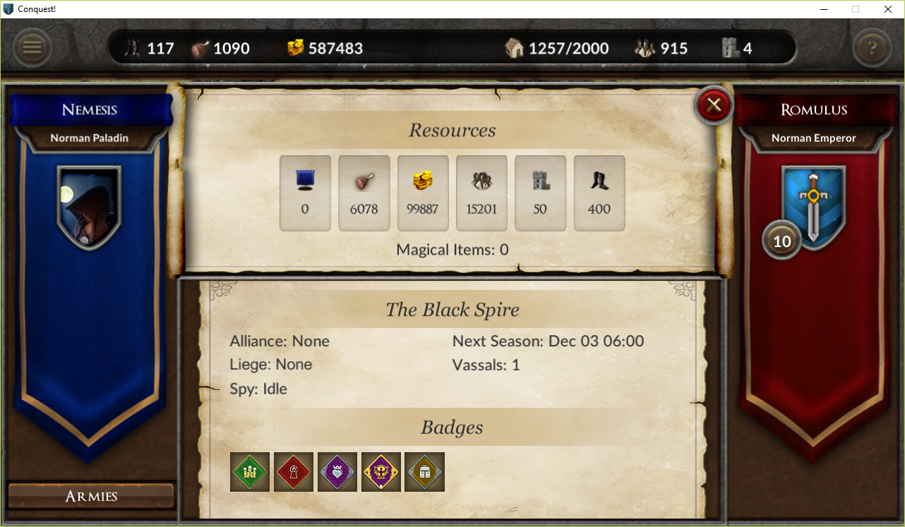
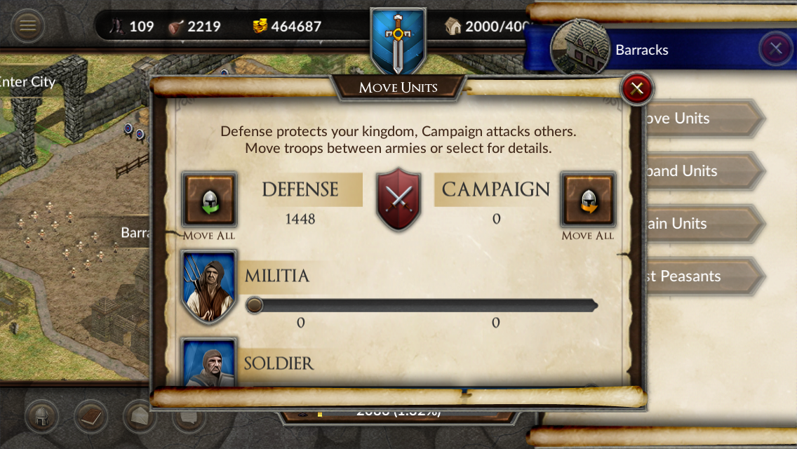
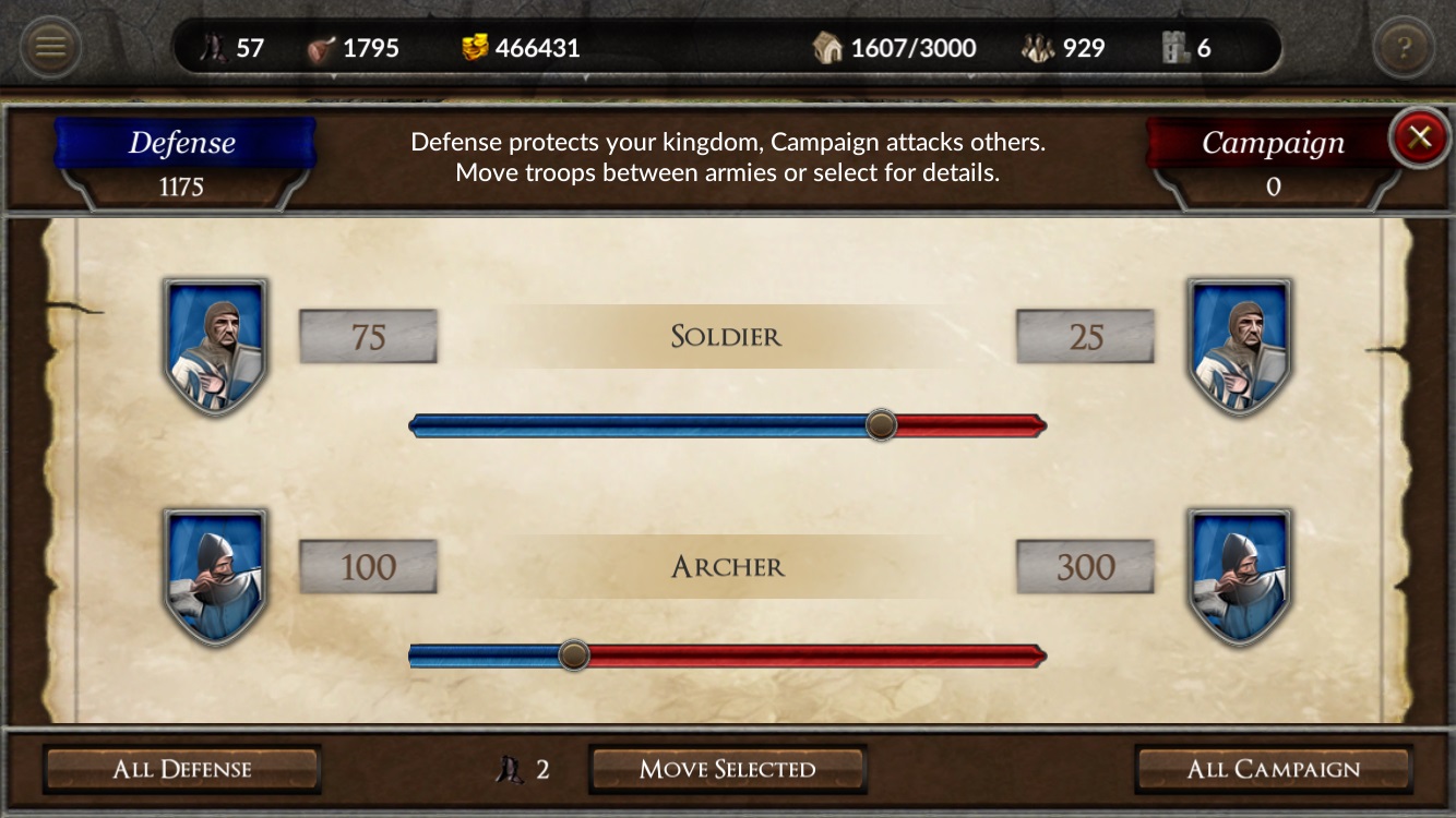
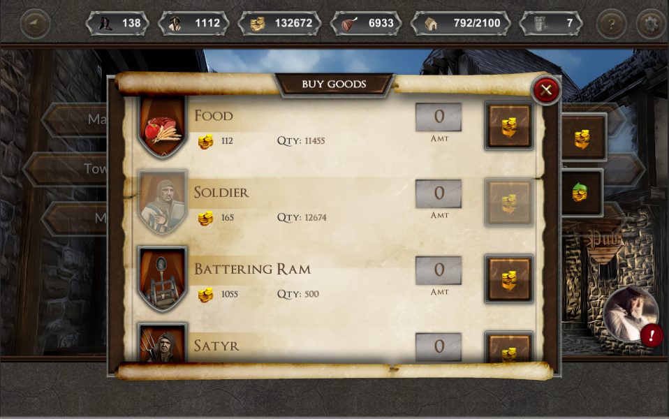
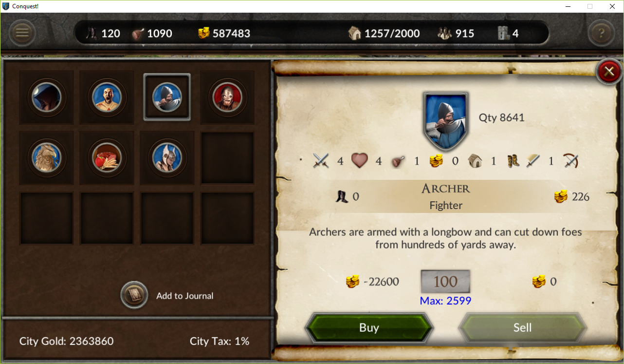
It has been a busy month as 2.0 improvements continue. Since my last post, we implemented new screens for spying, markets, moving troops, conducting surveys, vassal maintenance, and the kingdom overview! These changes continue the effort to enrich the experience and streamline gameplay. In this post, I'll compare some of the changes, starting with spying. In the original release, spying consisted of a popup window with 3 tabs: The first tab was used to send your spy and the other two displayed the player's kingdom and armies. It wasn't immediately obvious to players where the results appeared, especially during the tutorial (switching between tabs was manual). There was a lot of scrolling to see all the information. Now when you conduct spying a new window displays immediately: Switching between kingdom and armies is now marked with text (versus an icon only). The top and bottom portions are independent, so as you scroll the key information remains visible. Jump buttons (the small helmet icon in the 1.x screen) were removed when 2.0 was released (since they were unmarked some players didn't realize they were buttons at all). This screen is the same layout used for combat reports and it works nicely here. The next screen I'll review is moving troops: If a player wanted to move individual troops, the sliders were utilized. To save you had to scroll all the way to the bottom. The text area at the top displayed error messages, which could be missed unless you scrolled back to the top. With the new screen everything is clearly marked and players can use either the text boxes or the sliders to move troops: As players make changes to either text box the other is updated automatically to reflect the new amount. Finally, the buttons and text area are always displayed. The final improvement I'll discuss are the marketplaces. Players obtain troops in Conquest! from the markets in each of the cities. The original design used a popup with two tabs, one for buying and one for selling, and lots of text boxes and buttons. Like moving troops, a text area at the top was used to display information and errors but would not be visible if you were scrolled down. Clicking on an icon revealed an additional popup with detailed information but this was not intuitive. The replacement screen puts everything on display; there is no scrolling. Troop details are displayed right below the icon and error messages are upfront: I'm encouraged by the results and player feedback for all the changes has been positive. I continue to look for ways to improve what we have. Conquest! was raw when it was first released and there is still work to do. But overall, I'm happy in the direction it is going.
Sign up for the Conquest! mailing list here and follow the journey on Facebook or Twitter. Until next time, I hope to see you in the game
1 Comment
|
AuthorJames has been working on Conquest! since 1993. Archives
June 2024
Categories |
Copyright 1993-2024 GreenLion Gaming All Rights Reserved

 RSS Feed